Showing posts with label Forty Years of Calligraphy. Show all posts

Wednesday, March 03, 2021

Best Book Contest—You Can Vote!


I just found out that my book is on the list for Merrimack Valley Magazine's best book of 2020. You can vote for it: https://www.mvmag.net/2021-mvma-voting/ The books are at the very end so there's a lot of pages to go through to get there. Here's something from the original review by Doug Sparks.
"Calligraphy is a levelheaded look at the artistic process from someone whose relationship with words constantly shifts. It functions both as a crafter’s catalog and as an autobiography, as well as the record of a Merrimack Valley artist whose work spans decades and has remained invigorating, and grows more profound over time."

Wednesday, August 14, 2019

Calligraphy: How I Fell In, Out, and In Love Again


Calligraphy: How I Fell In, Out, and In Love Again is an illustrated memoir of my forty-year relationship with calligraphy—sometimes all-consuming, always challenging, and ultimately freeing. The story is about more than how to hold a pen and form letters. It is about growing up and growing older, questioning and slowly finding answers.

I've poured my heart and soul into my work and have done the same with this book. It is a personal statement that I have written, designed, and published. The complete book is 143 pages with 277 illustrations.

The book launches in one month, on September 14. I'll be sharing an image or a bit of text each day until then. Some of them will look familiar as the book is based on the forty blog posts I did at the end of last year.

from the introduction:

In the fall of 1978, I was an unemployed English literature major who had spent the past four years teaching swimming for the Boston School Department. I had taken courses in chemistry to prepare for studying nutrition, education to become a special education teacher, and children’s literature because I wanted to open a children’s bookstore. I don’t know that I could have verbalized it at the time, but I wanted more than a job or a career; somewhere deep inside I was seeking a life’s work. 


Monday, December 31, 2018

Forty Years #40: A Gift

Forty years ago calligraphy came to me as a gift. I was unemployed and searching for meaningful work and the chance request for lettering in a wedding album reconnected me with a high school pastime. It was a demanding gift that required hard work and discipline. It awakened my creativity but also my insecurities and doubts. The joy of working with words that I loved and the 26 letters that I learned to love kept me going until they didn’t. After years of focusing on making books, I slowly brought calligraphy back into my life.

In this second chapter, the gift has changed. Writing these 40 posts has helped me see the change. While I had been experimenting with freer letters for many years, they weren’t free in my heart. They were still in a semi-constant state of comparison and often came up short. Now I take them as they are, a spontaneous expression of the moment, drawing on my history and hard work but opening myself fully to the joy of pen and paper and ink. As the fortieth year of my involvement with calligraphy draws to a close, I am grateful for this gift and look forward to sharing it with the world without qualification or apology.

Thank you for reading. The entire series can be read, in reverse, by following this thread.

Sunday, December 30, 2018

Forty Years #39: How I Work Now


My current approach to calligraphy probably owes most to what I consider to be my signature work, the ongoing  Spirit Books series of handmade sculptural books using natural materials. While Childbirth Journey is the first work I consider to be truly my own, the form (traditional lettering and abstract pastel gestures) was not. The Spirit Books took four years to develop from my initial attraction to gathered sticks and vines and is more original in its concept. Over the 26 years and 100 books, I have kept the process as organic as possible. I have applied that same process to my calligraphy.

I never make sketches. I do not arrive at a design up front. I always work at the scale the final piece will be.
White Ellery House, Marker on Tracing Vellum, done on site

I usually don’t decide on the style of lettering until I start writing. The pen or brush, paper, words, and my state of mind lead me.
Speedball c nib & Dr. Martin's Bleedproof White


 Speedball C nib & Higgins Eternal Ink
Pilot Parallel Pen
Ruling Pen

I almost never make lines. I do on the few occasions when I am doing a longer original piece. If it is short and original, I’d rather do it multiple times than make lines. I think of Robert Henri’s assertion that  “every true work of art is the attainment of ... a more than ordinary moment of existence.” If I am doing work for reproduction (easier to post and share), I can make corrections in photoshop. My most frequent problem is having the lines go slightly higher on the right. I have been told that in handwriting analysis this is the sign of an optimistic personality. 

There are two things in my relationship with calligraphy that have allowed me to develop this approach. One is that I do not teach. I only have to learn or keep up with what I want. I have no obligation to be able to write a hand so that I can teach it. Two is that I do no commercial or commissioned work.  I can be completely personal in my focus. Of course, there are things that means I cannot do but I have chosen my path. Part of what these 40 posts have done is show me that I am where I am because of choices made. I can let go of paths not taken and fully appreciate the one I am on.

Saturday, December 29, 2018

Forty Years #38: The Power of Words

In 2015 I contacted the Clare Gallery at the Franciscan Center for Urban Ministry in Hartford, CT about an exhibition of the Spirit Books. They were interested but the gallery could only accommodate 2-dimensional work. Through a series of email conversations, we arrived at the decision that I would create large scale calligraphy banners at the gallery. I liked the idea of exhibiting calligraphy and inspirational quotes but I didn’t want to do framed work. I didn’t want the expense and I didn’t want the formality. I wanted to do something that was more immediate which led me to suggest that I would do the lettering live in the gallery.

I called the exhibit The Power of Words and chose short quotes that I felt would give comfort and courage. I thought of lines that one might want to have drift through one’s mind while online at the grocery store. I experimented with sumi ink but found it dripped and used Golden Liquid Acrylic with flow medium added and a 1 1/4 inch Silver Black Velvet brush. I liked that the softness of the brush’s edges gave letters that were not too crisp. The banners were four feet wide by six and a half feet long. I liked the way the large size changed the viewer's relationship with the words.

  The gallery presentation in January 2017 was a performance of sorts and I prepared by repeatedly writing the quotes full size on newsprint. In the studio, everything was set up to duplicate the experience in the gallery except the quality of the paper. I wrote each of the ten quotes about eight times. I felt that the design of the lettering needed to be both bold and airy. I don’t think I would have arrived at the style I used without Mike Gold’s workshop.
The lettering in the gallery went well. I only left out one letter (in the Kerouac quote at the top of the post) and I noticed it right away. The free form layout allowed me tuck it in before I moved on to the next line.
The banners were exhibited this fall at the Monastery Gallery in West Hartford, CT along with the Spirit Books. I lettered two more much narrower banners, again before an audience. I find that I enjoy the experience but also feel great relief when it is over.

Here is a pdf I made with images of the banners and information about the quotes. I did intentionally choose to have an equal distribution of women and men. I also wrote an article about the process for Bound & Lettered Volume 14, Number 3.


Friday, December 28, 2018

Forty Years #37: Mike Gold Workshop

In 2014 I took my first workshop since the week with Jenny at Green Gulch Zen Center in 1988. It was called Contemporary Scripts and taught by Mike Gold. The title and description sounded right up my alley. I was nervous about taking a workshop after so many years but was encouraged by the fact that Mike had studied privately with Jenny. We had corresponded when he wrote an appreciation of Jenny after her passing for Letter Arts Review.

The workshop was perfect. Mike was a fabulous teacher. He was teaching attitude and approach more than technique. He said, "Don't just make letters. Make art." He was generous, thoughtful, and kind. He took Edward Johnston’s analysis of manuscripts-slope, scale, pen angle, spacing (between letters, between words, between lines), shape, baseline, speed, texture-and gave exercises for playing with changes.

The workshop gave me confidence in the work I was already doing and led me to new explorations. One of the styles of lettering I now frequently use combines upper and lower case. This grew out of the solstice card I did shortly after Mike’s workshop. I was using the lines from St. Julian of Norwich, “All shall be well and all shall be well and all manner of thing shall be well.” I wrote it in standard upper and lower case but the many double ‘l’ combinations kept the eye from moving around the page and made the composition less lively. My solution was to combine upper and lower throughout the piece.
I liked the way it looked and continued to use it. I now consider that to be the style that is most my own.


Thursday, December 27, 2018

Forty Years #36: Outdoor Sculpture


In 2007 I stopped teaching bookmaking in schools and took advantage of the time to broaden my creative horizons. One of the things I did was take a workshop with Bruce Iverson on Chinese brush painting at the Newburyport Art Association. I enjoyed the class but felt that the cultural gap was too wide for me to bridge and make work that felt truly my own. It did, however, reawaken my desire to work with ink. I had also decided to participate for the first time in Outdoor Sculpture at Maudslay State Park in Newburyport. I made banners of sumi ink drawings using hemlock branches and attached them to hemlock trees. Although I had tested them in the weather, they were not able to withstand the solid week of rain that came right after they were installed. I was able to repair them enough to be presentable for the three-week run of the exhibit but they never returned to their initial glory. I didn’t let that stop me and tried them in a couple of other locations. I had some more unexpected weather challenges and abandoned them as a project partly because of the technical difficulties and partly because they had become repetitive.

The next year I was having trouble figuring out what to do. I turned to what had been my source of inspiration for so many years before—words. The theme was Trace (creating work that adheres to the theme is optional) and I chose to work with the words of nineteenth century poet John Greenleaf Whittier who had often visited Maudslay when it was a private estate. For Whispered Fragments: John Greenleaf Whittier, I hung Tyvek strips with lines from his poems written with Sharpie marker from two old apple trees.
The following year I used the words of a nineteenth century English poet, William Wordsworth. In a piece called Word Play, letters made of sticks attached to metal created a search and find puzzle in a tree which spelled out "Let nature be your teacher."
Two other Maudslay pieces used words. For The Spirit of the Garden, I wrote the words of Martha Brookes Hutcheson, designer of Maudslay’s formal garden on bricks  with paint and sand.
Breathe was my response to the theme Inside Out. 
My final piece of outdoor sculpture was at Flying Horse Sculpture at the Pingree School in South Hamilton, MA. I continued Whispered Fragments with the words of Emily Dickinson. I had many difficulties with the installation which I chronicled on my blog. It turned out that the four crab apple trees were in an incredibly windy place. I started with 88 strips. There were only 20 still on the trees when the time came to dismantle the installation. I decided that I would only work indoors from then on. 


Wednesday, December 26, 2018

Forty Years #35: Time for a Change


I wish I kept better track of dates but I believe it was 1988 when I stopped doing commissioned and commercial calligraphy. I made the choice for creative reasons but the business side of things had dwindled for me after our move from the Lowell area to Newburyport despite a lot of effort on my part. It was also the time that desktop publishing was beginning to take off and people were using their personal computers to create certificates and invitations. I wrote and shared this:

I have begun to do work that pleases me. For the first time, it is truly mine (text, calligraphy, & design). It is very personal, but also seems to speak to and for a lot of people. I feel strongly that I have something to offer & want to use all my time and energy to creates & promote my own work. To that end, I am no longer doing any commissioned work. 

At this point, my creative work still had calligraphy as its base. Over the next few years, I entered the world of handmade books and taught bookmaking, first to adults in workshops called Artmaking for Everyone: Simple Handmade Books and then to children in schools. At first look back, it seems I was particularly harsh in my separation. I began to call myself a book artist and didn’t mention the word calligraphy at all. Remembering more deeply, I think I needed to. People would introduce me as a calligrapher. People would talk wistfully about the work I used to do. I had to suppress my natural desire to please. It took a lot of energy not to make exceptions and stick to my plan. In my Artmaking for Everyone classes, students would lament that their books didn’t look as nice as mine because they couldn’t do calligraphy so I stopped using it. It had been a slow drift which became decisive. I was slowly on my way to becoming the “originating artist” Jenny had described.

Sunday, December 23, 2018

Forty Years #34: Christmas/Solstice Cards

Many of my holiday cards over the years have used my lettering. The card above was the first one I did using calligraphy. I was so excited I had it printed at a commercial printer. Dashing through the snow was written with white ink on black paper that was mounted white paper. I photocopied it onto red paper. The Fra Giovanni quote was written with a scroll pen and photocopied onto light green stationery.
I had a brief experimentation with silkscreen for the Wassail card. 

Joy to the World was done the Christmas after my first child was born. I think I may have already started to work on Childbirth Journey. 
The following year featured a brush drawing by my year and a half old son with a line from a song that is sung at the Revels.

My photocopier experiments showed up in some of my cards. The first is a photocopied yew branch. The circles are photocopied pizzelle cookies. 
Dona nobis pacem is another Revels song. I used gold gouache and silver marker and gold marker for the solstice circle.

When I learned photoshop, I used that for some of my cards. 

 I did this card the Christmas after our trip to Korea. I added writing in photoshop to a photograph taken at a temple and added the gold dot with marker to each card.
The flower card grew out of my series of kaleidoscopic photographs with lines from Emily Dickinson that was indirectly inspired by the Korea card. 
When I was in the full force of teaching bookmaking with recycled materials, I made printed the cards on recycled copy paper and made the envelopes from recycled paper too.
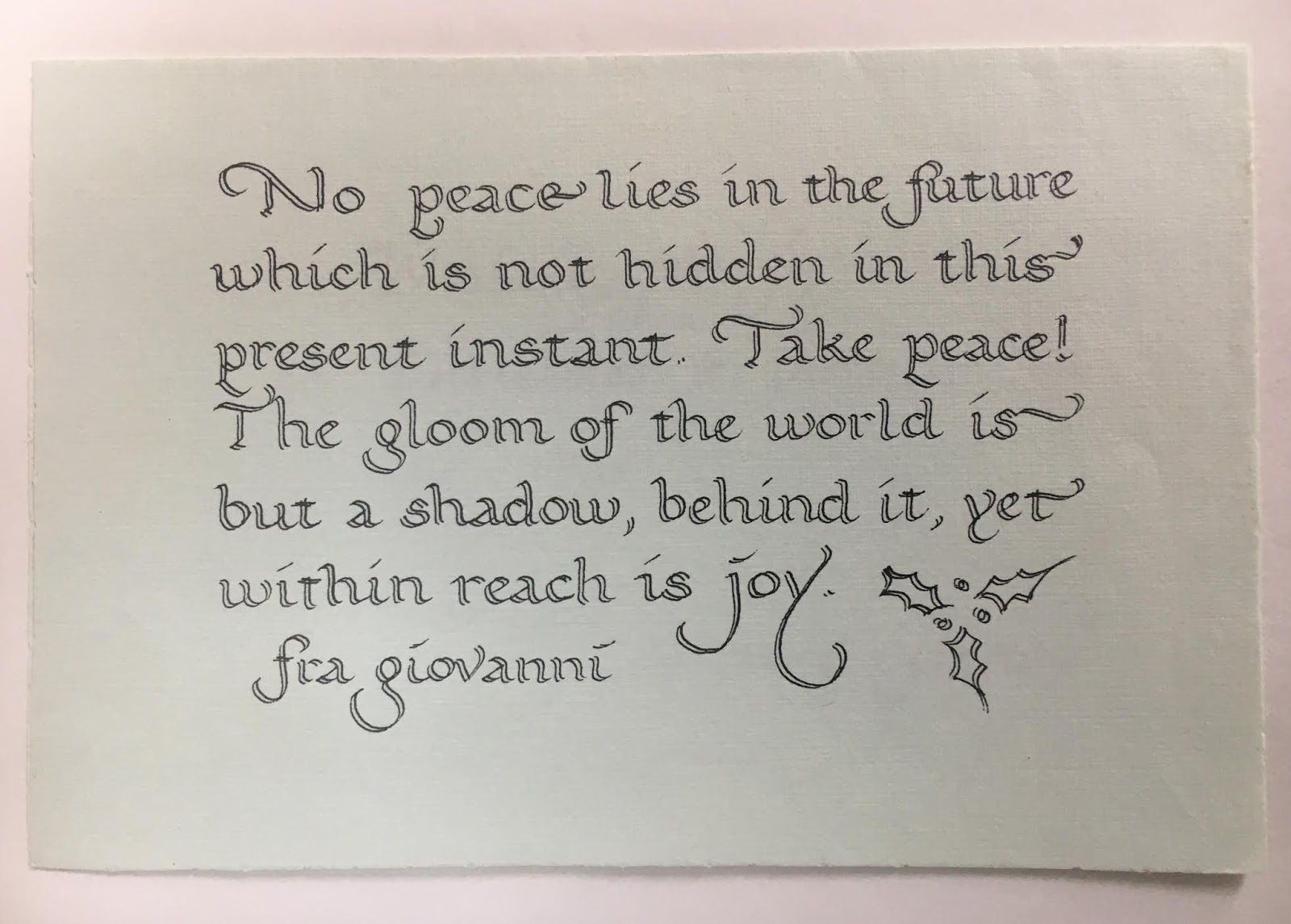
The year after I published Art Lessons, I used my favorite quote from the book by Fra Giovanni and hand lettered individual bookmarks for each card. 
The noel card was done after our three-week trip to Paris. The dots above each 'e' were done with gold marker on the individual cards.
The first of my switch to a postcard format, this one was inspired by the Masscribes workshop I took with Mike Gold.
Each year as the news is filled with more and more depressing things, I find it harder and harder to a make a celebratory card. I chose this quote from Albert Einstein (who I since found out was awful to his wife)'
and then another quote from Susan Cooper's The Dark is Rising series.
Last year's card was a tribute my mother-in-law who loved gardens, plants, and Latin names.


Related Posts Plugin for WordPress, Blogger...

ShareThis